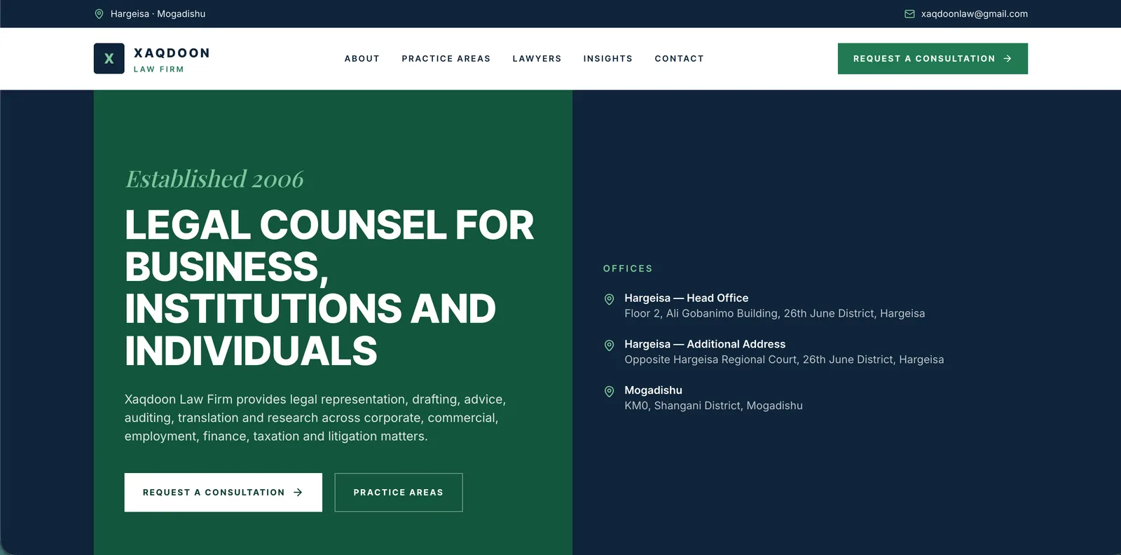
- Note A: The consultation request is always one tap away, in the header.
- Note B: One plain sentence says who the firm serves.
- Note C: Offices and addresses answer “where are you?” before anyone asks.
The brief
Xaqdoon Law Firm has advised businesses, institutions and individuals since 2006, from a head office in Hargeisa and a second office in Mogadishu. The site has to explain a wide practice in plain words and get a prospective client to ask for a consultation.
The challenge
A law firm’s practice is wide and its language is technical. Visitors arrive with one question — can this firm help with my matter, and how do I reach them? — and a site that buries the answer in legal prose loses them.
Design decisions
Lead with who the firm serves
The opening panel is a single sentence naming businesses, institutions and individuals, so every visitor finds themselves on the first screen.
Put the offices up front
Hargeisa and Mogadishu sit beside the headline. For a firm across two cities, “where are you?” is a first question, not a footer detail.
One action, repeated
“Request a consultation” is the only call to action, placed in the header and again in the opening panel, so the next step is never in doubt.
A restrained palette
Deep green and navy with plain type: serious enough for legal work, without the marble-and-gavel clichés.
What the site does
- Six practice areas set out on the opening screen: corporate, commercial, employment, finance, taxation and litigation
- All three office addresses in view from the first screen, with the email in the top bar
- “Request a consultation” in the header and again in the opening panel
- Pages for About, Practice Areas, Lawyers, Insights and Contact
My part
- Information architecture
- Visual design
- Front-end build
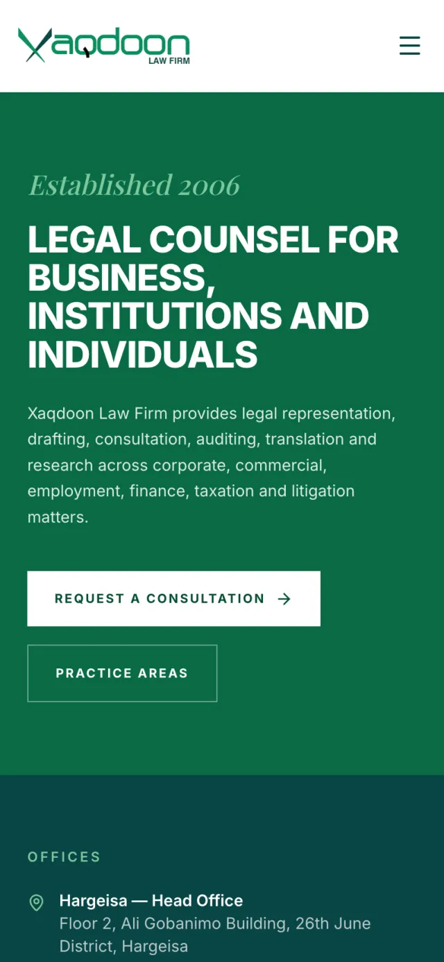
- Responsive layout
The result
The firm now has one place to explain its six practice areas in plain words, show where it works, and turn a visitor’s question into a consultation request.
See it live